
Global refugee migrations since 1975
In 2021, over 83 million people were living displaced from their home due to war, persecution or violence. Many governments refuse asylum to refugees; meanwhile, long-term refugees suffer various psychological hardships, and the root causes of the problem – war, famine, epidemics – remain unsolved.
Using data visualisation to create context and insight
The Refugee Project is a learning experience created to increase awareness about the plight of millions of people around the world who have had no choice but to flee their homes. Hyperakt and Ekene Ijeoma visualized migrations over time and space between 1975 and 2021. The interactive is based on UNHCR data, which is naturally limited in scope, because it’s difficult to register and count undocumented migrations. There is still plenty to learn though about some major political and social events in recent history.
An interactive experience
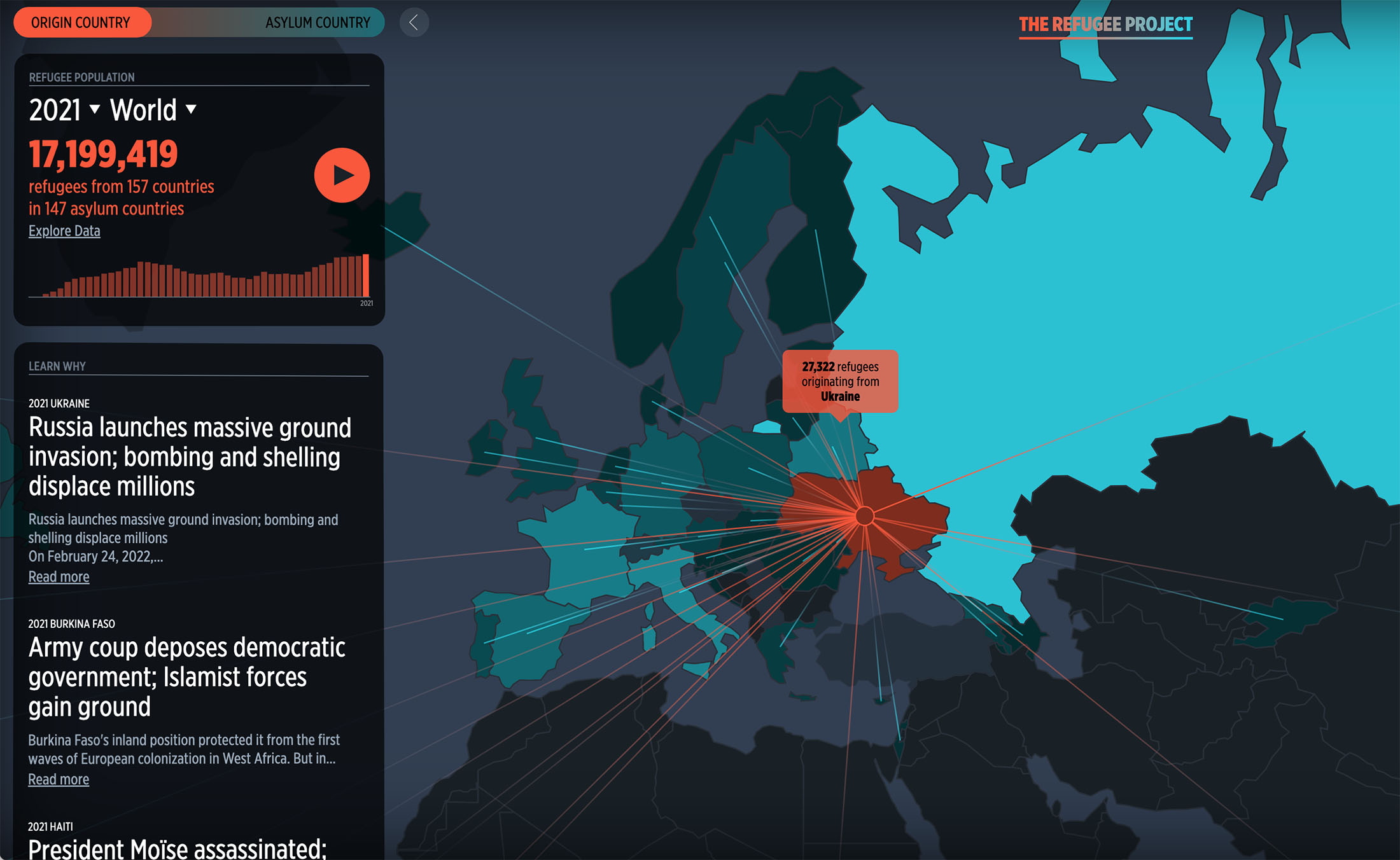
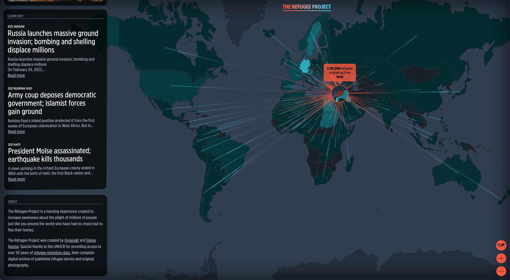
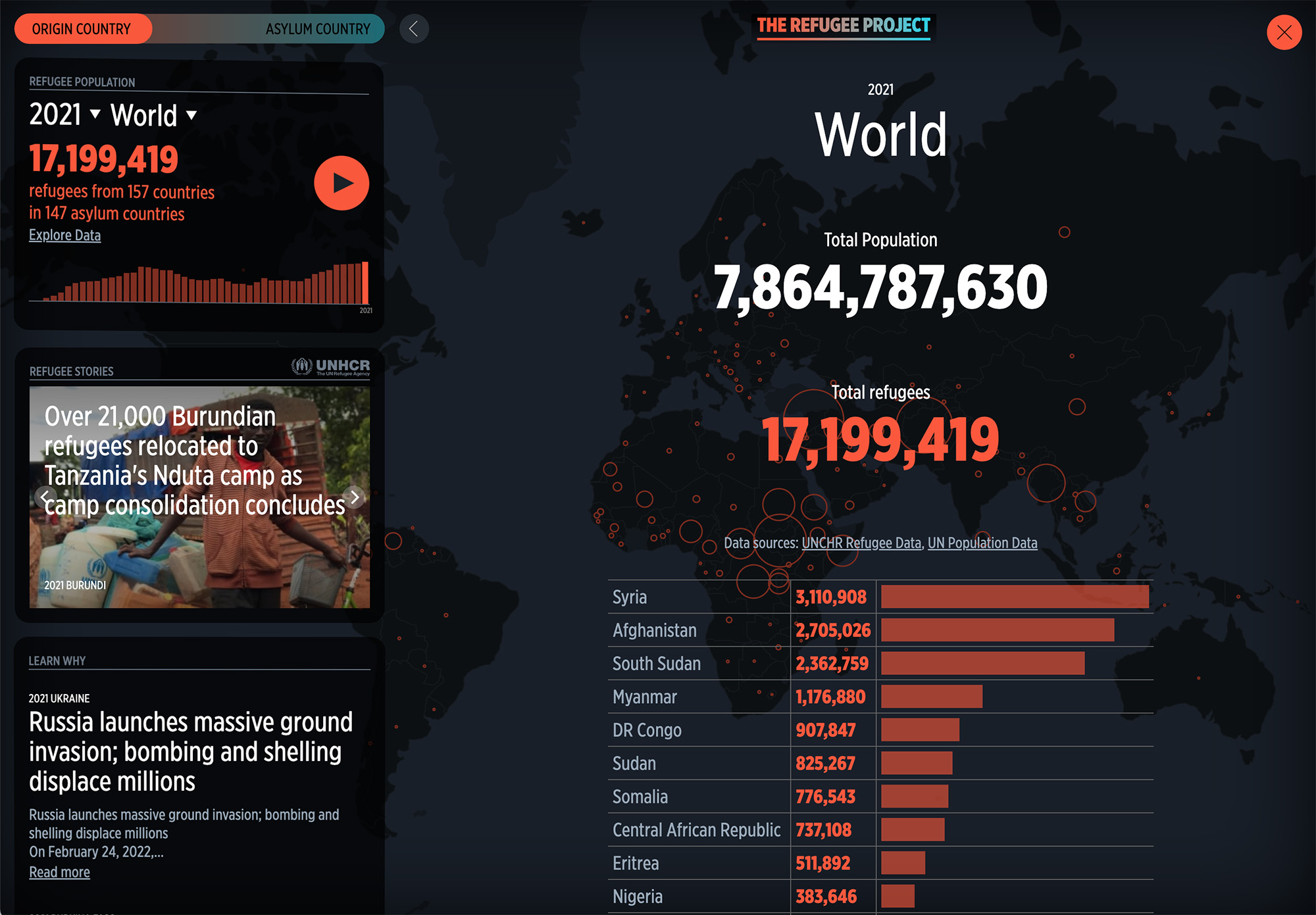
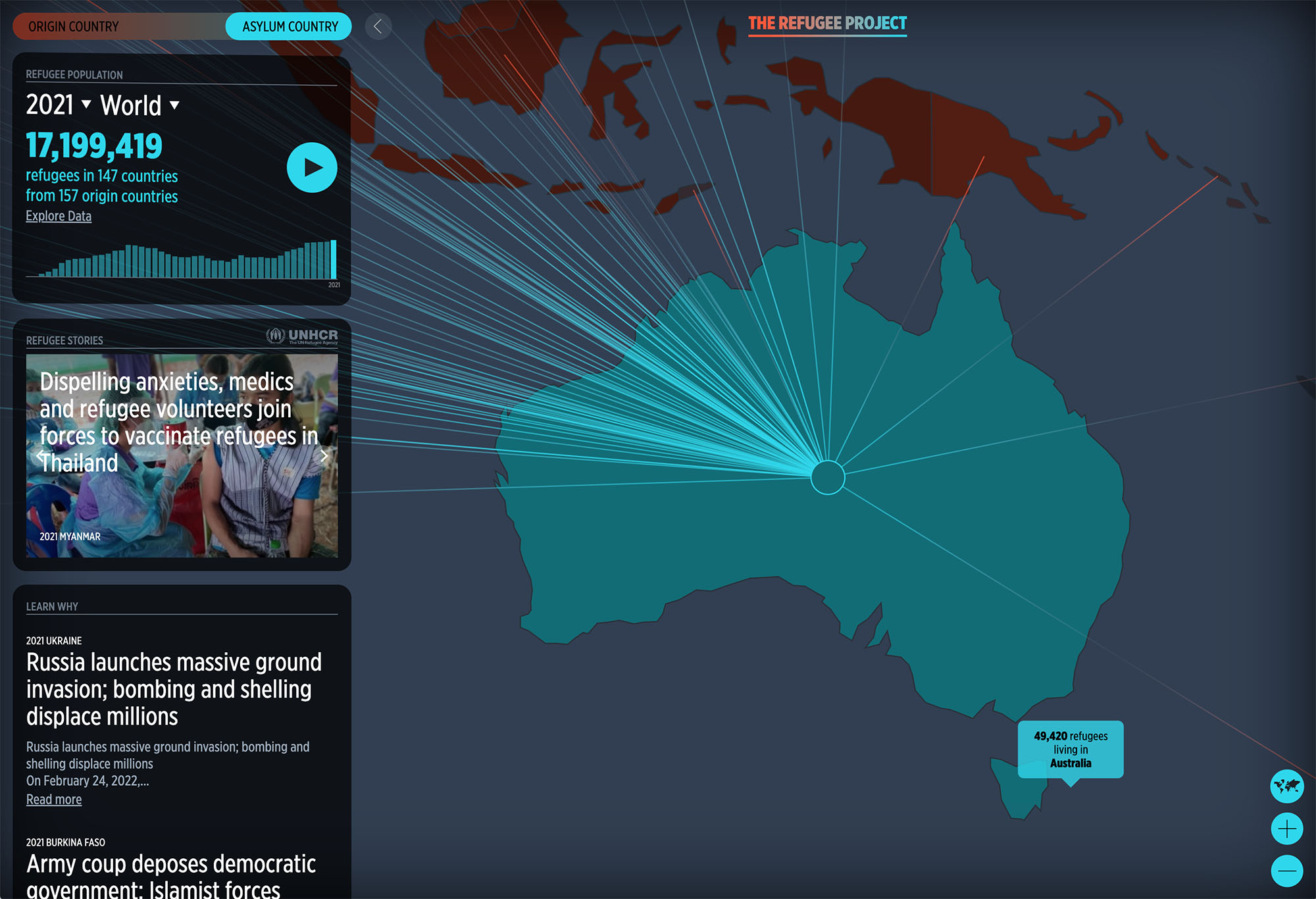
The map starts in 1975, and with each tick of a year, the circles adjust to show outgoing numbers or incoming numbers. Mouse-over a circle, and you can see where the majority of refugees went, represented with extending lines. In the left margin of the map, texts appear which provide more context about what happened.
Hyperakt and Ekene Ijeoma created an interactive experience that illuminates where and when refugees emigrate, as well as the complex stories of political, social and economic turmoil behind each displacement. By adding historical context to the shifting patterns of forced migration, the site highlights the impact each crisis has on people’s lives.
Highlighting the essential
Working iteratively, the makers created an interface that provided a global overview of refugee migrations and highlighted key information. The UI was kept simple, composed of three variables: a world map, an information dashboard with a bar chart timeline, and headlines linking to stories for each year.
Impact and recognition
The Refugee Project has accrued over 15 million page views since launching in January 2014, most of which originated at universities and high schools. It has been shared on Twitter to millions of viewers by global humanitarian organizations like UNHCR, Human Rights Watch, Oxfam International, UN Global Pulse and Amnesty International.
Museums and galleries in New York, London, Los Angeles, Istanbul, and Hamburg have featured The Refugee Project. In 2014, The Refugee Project was awarded a prestigious Malofiej International Infographic Awards Silver Medal in a competition dominated by journalism giants like The New York Times, The Washington Post, and The Guardian. The same year it received a Gold Medal in the Interactive category at the ‘Information Is Beautiful Awards’ organized by David McCandless.